Page 5 of 15
Re: The View buttons, mac Firefox
Posted: Jul 24th, '09, 20:46
by pb2q
pb2q wrote:The View button (with Coffee Cup) that shows up on the right of category/topic entries isn't being laid out correctly in Firefox on the mac. It's being bumped down below the category/topic title on the left which makes each list entry fatter. It isn't happening for me (it looks good) in Safari or WindowsXP Firefox/IE.
Browser Info: Mozilla/5.0 (Macintosh; U; Intel Mac OS X 10.5; en-US; rv:1.9.0.11) Gecko/2009060214 Firefox/3.0.11
The
View buttons have moved a bit: still newlined all the way over to the left, only now they overlap the following category/topic title:
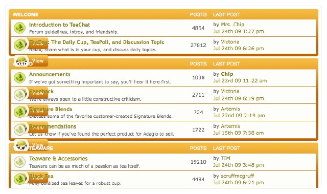
mac Firefox. The lists look great now on Safari and XP Firefox.
Land for the campesino!
Posted: Jul 24th, '09, 21:10
by Salsero
The static header seems to have gone from sounding like a good idea to be an object of hatred and derision such has not been seen since Marie Antoinette! I have to add my voice to the rabble crying "more real estate for the peasants!"
Re: The new look, which begs for tweaking
Posted: Jul 24th, '09, 21:31
by jazz88
brandon wrote:Chip wrote:JP wrote:Combined with the now giant fonts, I can barely read 3 posts on the page without scrolling.
How large or small fonts/images appear on your monitor depends on the resolution of your monitor. This is controlled by the user. And
you can change that any time.
800 x 600 screen resolution (about 5% of users) or even 1024 x 768 is not the best choice precisely for the reasons you mentioned. Also the images/photos look chunky (not good quality).
As for the scrolling, when you read a book you flip the pages. Online you scroll, you really can't avoid that.
@victoria – space at the top appears for example in Safari/Mac but not FF.
There could be x number of banners which could load randomly or a new banner every week. Just an idea ...
Re: The new look, which begs for tweaking
Posted: Jul 24th, '09, 22:02
by chamekke
jazz88 wrote:How large or small fonts/images appear on your monitor depends on the resolution of your monitor. This is controlled by the user. And you can change that any time.
Indeed you can. But it's fairly annoying to be told that if you don't like the large font size, you'll just have to
bite the puerh cake and change your monitor resolution every time you visit TeaChat ... then change it back again any time you browse the rest of the Web universe.
Given how many people are reporting that they find the fonts overly large, a more user-friendly approach might be to drop the font size down a bit at source AND to abandon fixed font size. Then any TeaChatters who really prefer their font size bigger can easily adjust it without having to wade through Display Properties on each visit.
Re: The new look, which begs for tweaking
Posted: Jul 24th, '09, 22:22
by scruffmcgruff
jazz88 wrote:How large or small fonts/images appear on your monitor depends on the resolution of your monitor. This is controlled by the user. And you can change that any time.
(snip)
As for the scrolling, when you read a book you flip the pages. Online you scroll, you really can't avoid that.
My monitor is set at its maximum resolution, 1440x900, and it looks bulky to me. I really can't read more than one full post-- maybe two if they are 1-2 sentences each.
Do you want to flip a page every few sentences? I certainly don't-- I also like being able to read a reasonably-sized block of text without scrolling, when possible.
jazz88 wrote:@victoria – space at the top appears for example in Safari/Mac but not FF.
I use FF/mac and see the empty space.
Re: The new look, which begs for tweaking
Posted: Jul 25th, '09, 01:16
by brandon
http://brandonhale.us/~brandon/teachat-new.tiff
Does this help? This is on my MacBook Pro @ 1280x800, maximized Firefox. I can fit one post. The banner is the worst offender of wasting space, but the post titles (which usually are just Re: Original Post and not meaningful after the first anyway) really add up too.
Re: The new look, which begs for tweaking
Posted: Jul 25th, '09, 09:36
by Riene
I use the Opera browser and am getting overlap in several of the thread titles, as in below:

What is the "add friend, add foe" stuff about?
The colors are realllllly orange-y...
Re: The new look, which begs for tweaking
Posted: Jul 25th, '09, 11:42
by geeber1
I've been getting some overlap on Firefox (PC) also.
Re: The new look, which begs for tweaking
Posted: Jul 25th, '09, 11:54
by Chip
Overlap, you guys just need bifocals.

Re: The new look, which begs for tweaking
Posted: Jul 25th, '09, 12:55
by Victoria
Riene wrote:What is the "add friend, add foe" stuff about?
From what I can see by looking at it so far is this:
Friends: When in your control panel or PM you can hover over their names and see their online status. Also you can quickly send a PM without typing their name. This might be helpful if you are friends with MASALACHAAAAIIIIII or someone else with a long name. You can also CC them by adding on to a PM or send a group PM by just clicking on your friends list.
Foes: This is seems will partially hide their posts. Plus PMs from them will have a different color stripe. I'd hate to think anyone here really has any "Foes". Even those people you may tend to skip ocassionally, you would still want to see I would think.
A new feature in PM that many of you may not have found yet is the addition of
FOLDERS. You can now make up to 3 additional folders of 100 PMs to save. This will significantly increase the mailbox size! You can use them as sent or saved. Assign a friend's name or a topic you are PMing to different people about. Or even label it such as for me; Samples to send, etc. Pretty cool!
Re: The new look, which begs for tweaking
Posted: Jul 25th, '09, 13:58
by Chip
PMs are not working quite right, sometimes they are simply disappearing after sending.
I sent some out and some went w/o a problem. Others would not send, even retried.
To add insult to injury, the entire PM was lost, had to rewrite it, resend, and still lost. No trace, not in out or sent box. POOF, gone.
So, do not assume your PMs are arriving at the intended destination.
Re: The new look, which begs for tweaking
Posted: Jul 25th, '09, 15:36
by brandon
http://brandonhale.us/~brandon/teachat-proposed.tiff
There is still a good bit of white space here, but this gives me almost a 3rd more vertical reading space.
I would really appreciate this banner going away soon, it is haunting my dreams and keeps on growing.
Re: The new look, which begs for tweaking
Posted: Jul 25th, '09, 15:41
by brandon
If you would like a temporary way to free yourself from the Flying Banner Monster, install the Stylish plugin for Firefox and create as script with these contents.
Code: Select all
@namespace url(http://www.w3.org/1999/xhtml);

@-moz-document domain("www.teachat.com") {

  div#headerTop {
    visibility: hidden;
  }

  div.post {
    font-size: .7em;
  }
}
Welcome to Brandon's world
Posted: Jul 25th, '09, 18:36
by Salsero
I am free, I am free!
It's like running around naked in the woods ...
... not that I have ever done that!

But it sounds like fun.
Re: Welcome to Brandon's world
Posted: Jul 25th, '09, 18:43
by scruffmcgruff
Salsero wrote:It's like running around naked in the woods ...
... not that I have ever done that!
But it sounds like fun.
The woods around here are infested with poison oak.
