The View buttons have moved a bit: still newlined all the way over to the left, only now they overlap the following category/topic title:pb2q wrote:The View button (with Coffee Cup) that shows up on the right of category/topic entries isn't being laid out correctly in Firefox on the mac. It's being bumped down below the category/topic title on the left which makes each list entry fatter. It isn't happening for me (it looks good) in Safari or WindowsXP Firefox/IE.
Browser Info: Mozilla/5.0 (Macintosh; U; Intel Mac OS X 10.5; en-US; rv:1.9.0.11) Gecko/2009060214 Firefox/3.0.11
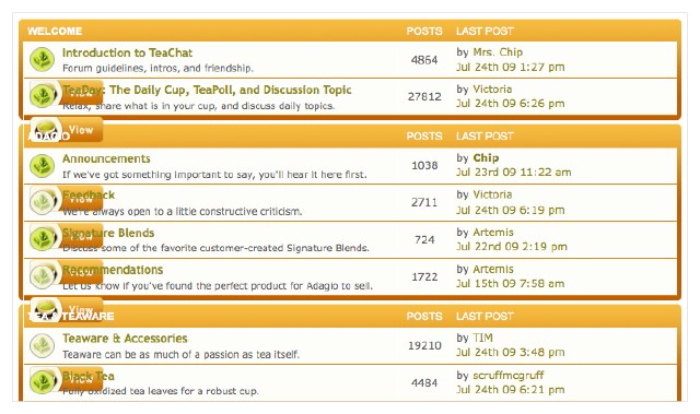
mac Firefox. The lists look great now on Safari and XP Firefox.