Here are some thoughts about these pictures compositionally not because I'm an expert but because conversations have to be started by someone. I am going to be critical, but not in a negative way, or 'as if I know' way, but in a curious way. I just want to point out a couple of things to open a discussion since there may be people reading who haven't had the opportunity to study the basics of composition. I'm not a BFA, but I play one on TV.

I chose these photos by Space because they were here, and also because he clearly submitted them not as compositional examples, but as example of the amazing D40.
First let me note that Space has a great compositional eye IMO. Doesn't matter if it's trained or learned, he's got 'it'. I'll focus on three compositional ideas/tricks/elements in these photos mostly because they are the only three ideas I know.

1) lead in diagonals and bridging elements ( my own terminology just because )
2)
rule of thirds
3)
Lead room.
The main question for me is 'what is the 'focus' of the picture? And the main concern is 'how is the eye led through the composition'. does it rest upon, or get jerked around?
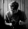
Space Samurai wrote:

^ the long diag the body makes is interesting, but leads the eye right off the picture. forum posts usually are read top to bottom, so any lead in to a focal point needs to come from top left usually. the light background leaf contrasting with the dark background however leads the eye back up to the head of the dragonfly, so not so bad. busy, eyes darting around.
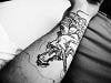
Space Samurai wrote:

^ this one is just BAM. Follows the rule of thirds, all the elements focus you on the bug, the lines and shading of the finger, etc. good composition, needs some better lighting on the bug to make it great.
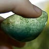
Space Samurai wrote:

This one is a little 'weird' I know, but I found some thing sweet about it, dying in a flower. (shrugs).
^ my take on what makes it feel off is the centering of the subject in the exact center of the picture. There is a diag lead in from bottom right which could have been taken advantage of better by moving the main focus upward and to the left in the composition. if that element had been extended a bit the smaller bug crawling and flowers in the background could better lead the eye up to the bug/spider and leave it there. lead room is usually indicative of motion also, so the room on the left of the bug implies the opposite of what the reality is, ie the bug is not moving. so some confusing stuff compositionally. Try imagining the photo per my suggestion with the main focus in the upper left quadrant and the little bug walking your eye up to it. what do you think?
Space Samurai wrote:

This picture didn't turn out well, so I messed around with it a bit, but I loved how it looked like a helicopter, with the shadow.
Actually this is a great example of why your camera doesn't matter. This is the best shot of the bunch compositionally IMO. It show lead room, rule of thirds, has an exciting diagnal lead in and the two foci play off each other perfectly. Notice the horizontal line that ties the two focus points together, it's a bridge that leads your eye between them. also the falling left to right diag is accentuated by the wood grain and the edge of the log. I think this photo could stand to be cropped a bit on the left hand edge ( try it by holding up your hand to crop it on the left right up to the tail of the shadow visually and watch the composition pop), but this is still good!
Anyway, I just wanted to start a discussion about more important stuff than gear...
Hope no-one takes this as the wrong kind of criticism. I really like your photos Space.
Pretty decent summary of the topic of composition here:
http://photoinf.com/General/Robert_Berd ... Design.htm