[edit - my own criticism added]
Quick statement of purpose:
I am striving in all of these photos to tie the teaware into it's function. I want the viewer to imagine sitting on the couch and reaching for the kyuusu, or fantasize about the pot riding on the bowl creatures back through amber tea clouds. Each of these compositions aim is that, not displaying the teaware ala studio photography. They are very much 'snapshots' in that regard.
^
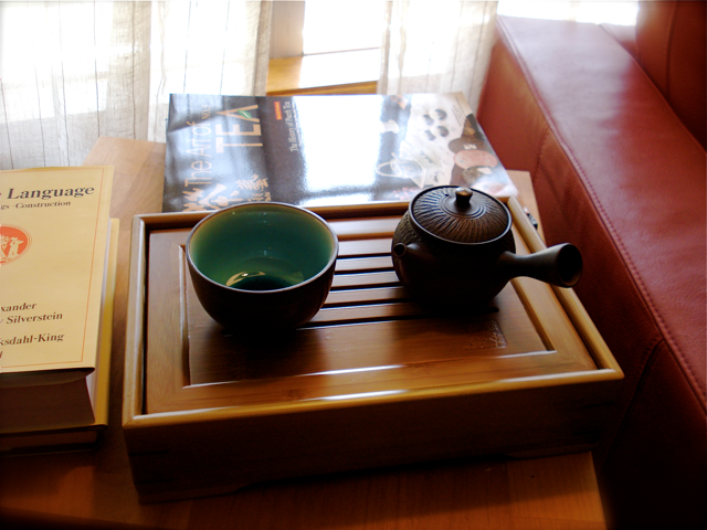
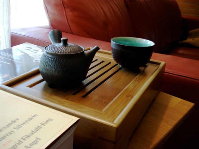
There are too many lines here, the tea service is constrained by the box of line around it so it appears isolated. Not my intent. I think removing pairing down the context would be useful. Also the book should probably be angled, it reinforces the edge of the tea tray too much.
^
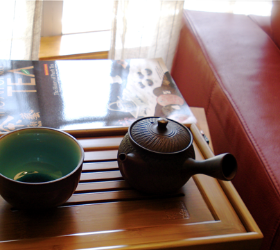
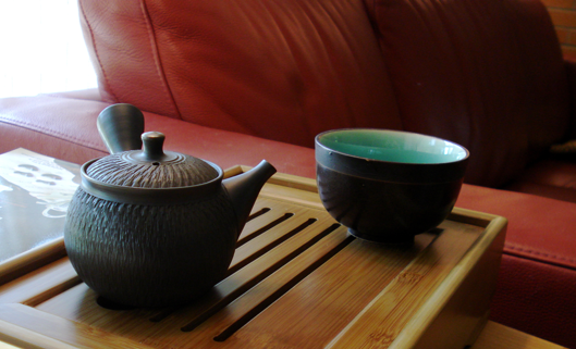
Maybe a crop with the handle right at the thirds point saying 'grab me'? hmnn. getting there, probably would need to recompose to fix.
^
I like this, it invites you to sit on the couch and have some tea. However, the foreground is horrible, all those angles and lines shooting all over the place. A crop may improve, you decide.
^
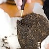
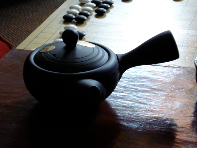
Horrible. The idea is so obvious, the execution so bad. lol. The problems begin with the ball on the top merging with the stones. The stones are supposed you lead you into the pot, but not that directly. lol. Also the four interecting lines on the left side are so distracting and horrible. I do think the light/dark balance is right except for the meaningless splash of red on the left. Here is a quick and dirty photoshop of it to correct those compositional flaws and probably introduce a host of others.

^
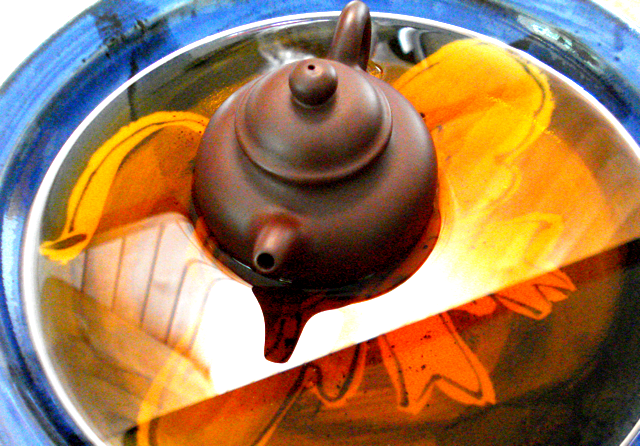
I actually don't know on this one. It's close to what I had imagined, but not all the way there and I don't know why. Help.
And now back to your regularily schedule programming, sorry for the flood I just get excited about stuff.