User avatar
Jul 29th, '12, 07:32
Posts: 474
Joined: Oct 6th, '11, 23:01
Location: Hong Kong, next China

Pottery and Color Balance Experimental Thread

by needaTEAcher » Jul 29th, '12, 07:32

I propose an experimental thread. Taking pictures of teapots has shown me that what I see in real life is different that the digital image saved on the camera, put online, and seen through your computer.

I know that geekgirl started a great thread on photographing ceramics, with this article:
http://digital-photography-school.com/h ... easy-steps

And that the concept of color balance was touched on early on:
shyrabbit wrote:...Aside from depth of field (DOF), the most misunderstood concept is the importance of white balance and the color temperature of the light source being used to light the subject. If the camera is not set for the proper light source, the real colors of the subject will be "off". This can be a big problem...online...
But I want to dedicate this whole thread just to color issues with pottery. I am posting teapots, but feel free to post anything.

I'll start off with three case studies:

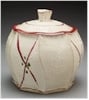
1-http://www.essenceoftea.co.uk/teaware/c ... eapot.html
This shows interesting color variation. I actually really appreciate that Essence of Tea posted them all together, to help us understand the color.

2-I have a new hieni pot, and I have had extra trouble photographing this little devil. Not matter what I do, it keeps coming out the wrong color. This was a source of some debate in another post. (More on this in the post below). Anyway, the flash makes it dark brown, and in natural sunlight the color looks off too. Closer but off. I finally changed the white balance to account for the warming tungston lighting, but this added a strange blue tint. This one is the closest to the actual color in real life, which is light black/grayish. Notice the background. In the kitchen shots the counter should be white, but the white comes out from blue to brown, never white.
Heini Single Brown.jpg
Heini Single Brown.jpg (36.38 KiB) Viewed 1678 times
Heini Single Warm.jpg
Heini Single Warm.jpg (28.3 KiB) Viewed 1678 times
Heini Blue Tint.jpg
Heini Blue Tint.jpg (27.23 KiB) Viewed 1678 times
3-Two shots of a modern zhuni pot I have, one with flash and one without. I will post that below. Closer color, but the flash shot seems to make it look more orange than it is. It actually has more of a darker brownish tint in real life.

So I ask you to take a few photos of your favorite pots with different settings to show the range of color that one pot can show. Duanni should do a good job of reflecting this, but really any teaware. I bet white gaiwans would also show this issue well.

I ask because I think that if many of us take part, this could be a great tool for learning about digital media and clay, as well as help all of us, as consumers, to make better choices when buying online (and make it harder to deceive us!). I look forward to (hopefully) positive responses. Also, if you have advise for those of us new to this phenomenon, please chime in!

User avatar
Jul 29th, '12, 07:35
Posts: 474
Joined: Oct 6th, '11, 23:01
Location: Hong Kong, next China

Re: Pottery and Color Balance Experimental Thread

by needaTEAcher » Jul 29th, '12, 07:35

Check out the pigs. I ended up shooting three different sets of pigs, all of which have a black heini pig, and in all of the shots, the black pig comes out brownish. So it's my camera and the white balance, but I am posting because I think this is probably a common problem for lower-end cameras. Those of us buying ceramics online should be familiar with these kinds of phenomena!

Edit: My wife just pointed out that screen angle, brightness, and white balance on the part of the viewer also influences what color you see. Good point!
Attachments
Pigs Brown Heini.jpg
Pigs Brown Heini.jpg (49.28 KiB) Viewed 1676 times
Zhuni No Flash.jpg
Zhuni No Flash.jpg (25.73 KiB) Viewed 1676 times
Zhuni Flash.jpg
Zhuni Flash.jpg (30.72 KiB) Viewed 1676 times

User avatar
Jul 29th, '12, 11:01
Posts: 1796
Joined: Sep 15th, '09, 16:11
Location: Wilton, New Hampshire USA
Been thanked: 2 times

Re: Pottery and Color Balance Experimental Thread

by JBaymore » Jul 29th, '12, 11:01

For doing serious photo and layout editing for commercial print reproduction on a computer platform, there are applications that let you color correct the rendition on the VIEWING monitor to make sure that the printed color is the same as what you are seeing on your editing screen. The high end page makeup apps and the commercial printing houses provide this stuff for you.

If you are getting this critical about the images you see on your machine for web-surfing use....... you are in for a bunch of technical fun. :wink:

Lacking color corrections on the end user's monitor.... everyone viewing an online file is seeing slightly different renditions of the actual image....even if the original file was accurately white balanced and gamma corrected.

best,

......................john

User avatar
Jul 29th, '12, 16:36
Posts: 5896
Joined: Jan 10th, '10, 16:04
Location: Los Angeles, CA
Contact: debunix

Re: Pottery and Color Balance Experimental Thread

by debunix » Jul 29th, '12, 16:36

JBaymore wrote:Lacking color corrections on the end user's monitor.... everyone viewing an online file is seeing slightly different renditions of the actual image....even if the original file was accurately white balanced and gamma corrected.
Yes!

But if you're serious about the subtleties of color balance, you want to use a serious photo editor for the initial photo processing, so you at least start out with a well-balanced image before it gets mangled by viewer's browsers and monitors. I save all my stuff in sRGB from photoshop in hopes that it will be as close to standard as I can get for most web browers/ monitor setups.

If you were really paranoid, you could be sure that a bit of pure white porcelain is included in every image, to use for color balancing control, but then you still have to take into account the effects of reflections form warmer or cooler tones things nearby, the color temperature of your flash, and the height of the sun--high noon is best if you want product shots to most accurately reflect the color of the object for sales use, but sometimes what you want is that warm golden glow of late afternoon or crispness of early morning tones.

User avatar
Jul 29th, '12, 18:46
Posts: 474
Joined: Oct 6th, '11, 23:01
Location: Hong Kong, next China

Re: Pottery and Color Balance Experimental Thread

by needaTEAcher » Jul 29th, '12, 18:46

I have to admit that I have avoided touching the color balance on the computer because I am intimidated by the technical side of it. :oops: But this is just the right push. I'll start playing around with it and see what I can find.

Thanks, and I hope some other people post their own interesting color variation shots!

User avatar
Jul 29th, '12, 19:10
Posts: 5896
Joined: Jan 10th, '10, 16:04
Location: Los Angeles, CA
Contact: debunix

Re: Pottery and Color Balance Experimental Thread

by debunix » Jul 29th, '12, 19:10

I made a little set on flickr about web browser color management a few years ago....after seeing stuff like this

Image

and this

Image

and got sad and gave up, mostly, but I do work on color management in photoshop to start with the best material I can...

User avatar
Jul 29th, '12, 19:55
Posts: 5896
Joined: Jan 10th, '10, 16:04
Location: Los Angeles, CA
Contact: debunix

Re: Pottery and Color Balance Experimental Thread

by debunix » Jul 29th, '12, 19:55

An example of a subtly wrong color correction that I didn't notice at the time:

Image

Left is the raw image, right is the photoshopped copy, and in front of them is the actual cup, here photographed in filtered/indirect sunlight, not the bright warm late afternoon sun of the original shot. The 2nd version of the photo is notably redder, but even the 'raw' photo is warmer than the actual cup, both because the cup is overexposed in this combined image, and because the cup was originally photographed with that warm (redder) direct sunlight.

It's hard to see the extra red of the 'copy' image in this shot as posted on teachat--click the image, go to my flicker, and view a larger version to see the redness, most obvious in the bamboo mat background.

User avatar
Jul 29th, '12, 21:10
Posts: 1796
Joined: Sep 15th, '09, 16:11
Location: Wilton, New Hampshire USA
Been thanked: 2 times

Re: Pottery and Color Balance Experimental Thread

by JBaymore » Jul 29th, '12, 21:10

To do this "for real" you'll need a physical color calibration package from someone like Pantone. The kits are about $100.

Some more basic references are here:

http://www.gballard.net/boutique/colorcorrecting.html

http://www.photofriday.com/calibrate.php

http://www.pcworld.com/article/110070/d ... nitor.html

http://beesbuzz.biz/art/tutorials/gamma.php

best,

.......................john

User avatar
Jul 29th, '12, 22:06
Posts: 319
Joined: Dec 29th, '09, 14:28
Location: Cazenovia, NY

Re: Pottery and Color Balance Experimental Thread

by GreenwoodStudio » Jul 29th, '12, 22:06

For me as a potter who sells online. The only practical way to photograph my work is to just take decent pictures to start with, good full spectrum bulbs and my camera on the vivid setting. It's already an incredibly time consuming affair. If I were mess around with filters and Photoshop I could spend more time photographing the work and manipulating the image then making it. That's just me though and I appreciate the topic :)

User avatar
Jul 29th, '12, 22:31
Posts: 5896
Joined: Jan 10th, '10, 16:04
Location: Los Angeles, CA
Contact: debunix

Re: Pottery and Color Balance Experimental Thread

by debunix » Jul 29th, '12, 22:31

You do want to manipulate as little as possible, for sure, when you're doing it for production. I've also got my routines down in photoshop so that they're a lot quicker for pushing through a few dozen images at a time by making and using a lot of macros, and being better at setting up the photos so they're better out of the camera.

User avatar
Jul 29th, '12, 22:43
Posts: 474
Joined: Oct 6th, '11, 23:01
Location: Hong Kong, next China

Re: Pottery and Color Balance Experimental Thread

by needaTEAcher » Jul 29th, '12, 22:43

debunix wrote:You do want to manipulate as little as possible, for sure, when you're doing it for production. I've also got my routines down in photoshop so that they're a lot quicker for pushing through a few dozen images at a time by making and using a lot of macros, and being better at setting up the photos so they're better out of the camera.
That makes sense. Thanks for the photos! Actually, I had a failed business about 2 years ago. We did a bunch of advertising testing, and, strange enough, the most successful tests were with images that were super saturated...I'm talking obvious (at least to me), yet that ended up getting the most hits. I wouldn't have used those photos, ultimately, but I tested it out of curiosity.

Thanks for the links, JBay!

User avatar
Jul 29th, '12, 22:47
Posts: 1796
Joined: Sep 15th, '09, 16:11
Location: Wilton, New Hampshire USA
Been thanked: 2 times

Re: Pottery and Color Balance Experimental Thread

by JBaymore » Jul 29th, '12, 22:47

GreenwoodStudio wrote:It's already an incredibly time consuming affair.
You can say that again.

best,

....................john

User avatar
Jul 29th, '12, 23:49
Posts: 5896
Joined: Jan 10th, '10, 16:04
Location: Los Angeles, CA
Contact: debunix

Re: Pottery and Color Balance Experimental Thread

by debunix » Jul 29th, '12, 23:49

needaTEAcher wrote:We did a bunch of advertising testing, and, strange enough, the most successful tests were with images that were super saturated...I'm talking obvious (at least to me), yet that ended up getting the most hits.
I see a lot of that on my photography forums--super saturation that really misrepresents the subjects, and leads to disappointment when you see the object/flower/animal/landscape in person. I try to limit my saturation adjustments to those that naturally come from darkening overexposed subjects, and minor changes to curves/contrasts--virtually never touching vividness and saturation settings, because that way madness lies....

User avatar
Jul 30th, '12, 01:18
Posts: 474
Joined: Oct 6th, '11, 23:01
Location: Hong Kong, next China

Re: Pottery and Color Balance Experimental Thread

by needaTEAcher » Jul 30th, '12, 01:18

debunix wrote:
needaTEAcher wrote:We did a bunch of advertising testing, and, strange enough, the most successful tests were with images that were super saturated...I'm talking obvious (at least to me), yet that ended up getting the most hits.
I see a lot of that on my photography forums--super saturation that really misrepresents the subjects, and leads to disappointment when you see the object/flower/animal/landscape in person. I try to limit my saturation adjustments to those that naturally come from darkening overexposed subjects, and minor changes to curves/contrasts--virtually never touching vividness and saturation settings, because that way madness lies....

Madness.....and unethical advertising tactics!

+ Post Reply